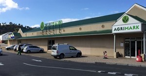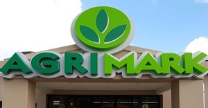
"Going forward, Agrimark will be positioned as the main customer-facing brand and the group’s trade and retail businesses will all adopt the Agrimark brand name. This means that existing brands including Wesgraan, Pakmark, Liquormark, and Kaap Agri Mechanisation will be retired.
"Alongside our Agrimark stores, our Agrimark brand now includes Agrimark Grain, Agrimark Mechanisation, Agrimark Liquor, Agrimark Packaging, and Agrimark Tyre and Fitment. Agrimark value-added services include Agrimark Financial Services, and the newly-launched Agrimark App.
"Financial Services is being positioned as a more customer-facing offering and new growth projects will also carry the Agrimark name, like Agrimark Pet, our new standalone pet store, the first of which is scheduled to open in Cape Town in December."
"Apart from achieving cost efficiencies, moving from several different brands to one main customer-facing brand will ensure our one-stop agri-lifestyle offering becomes more recognisable, especially amongst new customer segments," says Walsh.
He adds that the consolidated Agrimark brand structure will also benefit the company’s suppliers and their product brands as the group continues to optimise its retail offering.
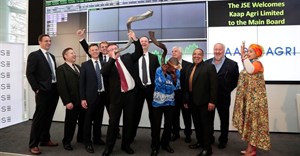
At a corporate level, the Kaap Agri brand will remain the parent brand and will be focused on employees, the investor community and other external stakeholders.
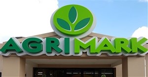
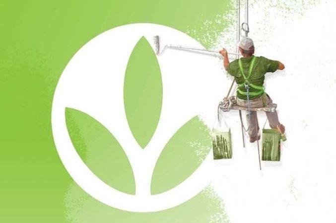
As part of the strategy, the Kaap Agri logo has been modernised, so that it lives comfortably with an updated Agrimark logo. To signal the brand changes to customers and bring the trading brands together, all of the Agrimark sub-brands will have similar logo treatments.
"We retained the green colour scheme, the circular icon shape, and leaf icon reflective of nature, growth and our strong heritage. We have however modernised and revitalised the font and colours, removed the 3D features of the icon so that it’s easier to reproduce and made it more open and friendlier," says Tasneem Sulaiman-Braym, Kaap Agri corporate affairs director.
"Our brand research confirmed that the Agrimark name has an incredibly deep resonance with our customers. The name signifies a strong heritage, with a deeply entrenched value system, long-standing relationships with our customers, and customer service par excellence. This brand is true to our past and relevant to our future, whilst still being modern and fresh."
Following stakeholder research, Kaap Agri found that it was going to be important for the 108-year-old business to modernise its brand identity to attract a broader customer base, whilst still retaining appeal to its bedrock customer, the commercial farming sector.
"Our Agrimark brand position reflects our agricultural heritage and retail ambitions. Agrimark celebrates and champions a rural way of life. It’s a positioning that goes beyond targeting a demographic and builds a connection with customers over a shared attitude, lifestyle and passion. The agri-lifestyle gives us authenticity and is our differentiator in the retail market. We’re for farmers, families and friends."
Sulaiman-Bray says that these brand truths will be applied across touchpoints to generate consistent and meaningful brand experiences.
The new brand identity is already being embraced by employees with the launch of an internal campaign, Growing Together.
"For our people, the refreshed brand and iconography is reflective of the positive changes to the business, but also emphasises that there’s a lot that won’t change. Our unifying culture of CARE, our community service, and emphasis on genuine, personal customer service will continue to be at the heart of what we do. Together, with all our stakeholders, we will Plant and Harvest, Dream and Do, Care and Grow."