When I finished my yoga class at the Virgin Active the other day and wanted to, as usual, reward myself with a smoothie, I was surprised to see that the Kauai corner looked completely different: sleeker, cleaner and whiter at first glance.
My suspicions of a total make-over were confirmed, when my favourite Peanut Butter Bliss smoothie didn't taste as sweet as it used to: the redesigned menu stated that sugar-free peanut butter is now being used. Other items on the menu had changed as well: the chicken now being free-range, no more sandwiches, beef and wheat grass and instead a whole lot of kale and other superfoods. Yes, it seems as if Kauai has managed to become even healthier!
After 19 years, Kauai changed ownership in May of this year, and according to the website is now on the path of a "Realvolution", which means that they "source fresh, natural produce - real food that is free from all the nasty stuff. Where possible our food contains no colourants, flavourants, preservatives, hormones or GMOs. It's our preference to source local with a focus on Fair Trade, ethically-sourced produce."
This is great news for those of us who like healthy food from good sources, even at a slightly more expensive price tag. As a loyal and regular customer, I'm really thankful that one of the wraps is still vegetarian and still delicious with goats milk cheese and yes, that the peanut butter is now sugar-free. I was also delighted to find out that those beloved smoothie stickers can now be accumulated on a custom-app.
As a graphic designer, I like the modernised simplicity of the new look. The old logo depicted a smiling sun, which looked very friendly, but also as if it could represent a Hout Bay hippie clothing brand. The brand colouring used to be in shades of blue, which evoked the blue Hawaiian sea to me, even in the midst of depressing Johannesburg shopping malls or a rainy Cape Town winter.
The friendly sun face was supported by graphics of stylised Hawaiian flowers (what can I say: I'm a sucker for brand language). The cherry, or rather pineapple, on top was that one was always greeted by a friendly "aloha!" Are staff still going to greet in this fashion? The new slogan "Made naturally, served happily" makes it sound as if they might.
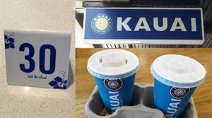
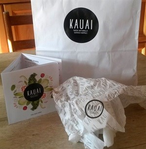
The new logo is a simple black circle, with just the logotype on the inside. The typeface is friendly and informal, and looks hand-rendered (and skinny, like my butt will be after drinking all those sugar-free smoothies). Basically, like any other logo that will come up on a Google image search for "hipster logo" (try it - I dare you!) The food photography is very tasteful and just as trendy: exploded shots seen from above on a white background.
The aspect that I'm really the most intrigued but also disappointed by, is the colour change from blue to black. Even though the logo shape and typeface are very different, the overall effect reminds me of the Woolworths brand. Both brands sport the same pared-down design language, and stand for quality food sourced ethically (Woolworths call their version 'The Good Business Journey').
This makes me wonder if the colour black has become synonymous with health and brand goodness. Black has always represented classic style and elegance (little black dress) but wholesomeness? Or has simplicity become a visual metaphor for wholesomeness?
Without a doubt the new identity is more sophisticated, but in my opinion, there were some valuable aspects to the old Kauai identity that have been lost. The touches of island-style added a uniqueness and joy to the brand, as did the colour blue. The brand could have been evolutionised to still be simpler and tré chic, without it being this much of a visual revolution. The new logo and colour are just too ubiquitous to tantalise my taste - visually only of course. I'm already in the queue for another smoothie...