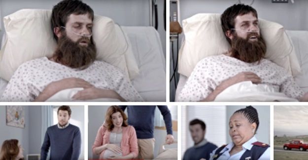


It was brave of Mahindra to commit a large chunk of money to flighting an ad during the game and perhaps they had some sort of inkling that the Boks would be woeful… and therefore that their ad would gain more attention from frustrated and bored fans.
And the ad was certainly funny and entertaining. My wife laughed out loud – as did my brother-in-law.
We see a man awakening in hospital from a three-year coma, his hair and beard long and matted. As his eyes focus, he sees his wife; then his brother. His brother looks sheepish.
Then his wife says: “Meet your nephew…”, indicating by rubbing her clearly pregnant stomach. You can see the coma man’s internal calculator clicking over: three years… nine months?
The nurse, who overhears this, mutters “that’s heavy…”
And that’s the punchline – because the whole soap opera is taking place in a set being towed behind a Mahindra Pik Up bakkie. The vehicle, clearly, can cope with “heavy”.
So the point is made humorously and effectively.
Mind you, when my wife stopped giggling, I asked her who the ad was for. She didn’t know… which also goes to show the risks of entertaining people so much they miss your marketing point.
Still, it is an ad which does stand out, so it gets an Orchid from me.
Design is a crucial aspect on any piece of marketing communication – and, too often, not enough attention is paid to it.
In particular, print ads are often rendered almost useless because the designer who drew up the ad didn’t think about the environment in which it would be running. And, one of the biggest mistakes made by designers is thinking that the words they can see clearly on their screens will be just as easy to see on a printed page.
So, you will frequently see text colours which blend into background colours because, no matter the printing process, the result on paper is not going to be what you see on screen.
But the biggest mistake designers make is using print fonts that are too small. Most newspaper stories run at what we call 9 or 10 point. This makes it reasonably legible for someone who doesn’t need glasses to see. Any smaller and even someone with good eyesight might have to squint – and smaller still, they will have to reach for a magnifying glass.
I saw a classic example recently in a newspaper ad for Chinese car brand Haval (the luxury brand of GWM), which was boasting that its H2 model had achieved a “5-star ANCAP rating*”
The asterisk was meant to direct people to the lower part of the ad, where the acronym ANCAP would be explained. I know, as a petrolhead, that ANCAP stands for Australian New Car Assessment Programme… but most people probably don’t know that, and especially the young, upwardly-mobile families who would be the target market for the H2 SUV.
Yet, the print explaining what ANCAP meant was in type so small that I could barely make it out, with my glasses on.
Really, really stupid, considering the whole point about the blazing headline was to boast about the car’s safety – and ANCAP is one of the most highly-regarded car crash-test programmes in the world.
So, an opportunity to make the most of a really good selling point was not maximised, because no-one bothered to look at the ad (literally) through the eyes of a consumer.
So an Onion to Haval’s designers – but not to the company itself, because the idea was a good one, just badly executed.
